EN
Speira GmbH

At ALUMINIUM 2026, Speira presented itself on a large, two-storey trade fair stand. We designed the presence in the space, from the walls to the meeting rooms and ceiling banners to the screens and the fluid animation.
The aim was to guide visitors sensibly through the world of Speira products and labels.

Before we designed the first wall, we thought of the stand from the visitors' point of view. Which direction do they come from? Which wall do they see first, and which message has to be right there?
From these questions we developed a user journey that divides the stand into clearly defined areas. Visitors thus encountered different products and messages at different points, in a sequence that follows a conversation rather than a catalogue.
The dramaturgy of the space was set before we decided on motifs and formats.


For the specific messages and designs we drew on assets we had previously developed for Speira. Texts, visuals and the namings of individual products and labels found their place in the space; the stand thus spoke the same language as the rest of the brand communication.
The connecting element was the aluminium fluid, which we had designed as the key visual for Speira. On the trade fair stand it became the recognition feature, as a surface on walls and ceiling banners and as a fluid animation in motion on the screens.

We deliberately played the two floors differently. On the lower level, attention-grabbing designs and texts took centre stage, arousing interest while informing about products and labels. This is where it is decided whether a visitor stops.
On the upper level, the perspective shifted from product to brand. On the walls we played out the messages of the image campaign, carried by the formula “Redefine the limits of …”. The stand thus led from the specific product at the bottom to the company's attitude at the top.
The meeting rooms also became part of the brand journey. Each of the four rooms received its own name and focus. The interior design was matched accordingly, so that each room had its own atmosphere.
Conversations therefore did not take place in a neutral meeting room, but in the middle of the world they were about.

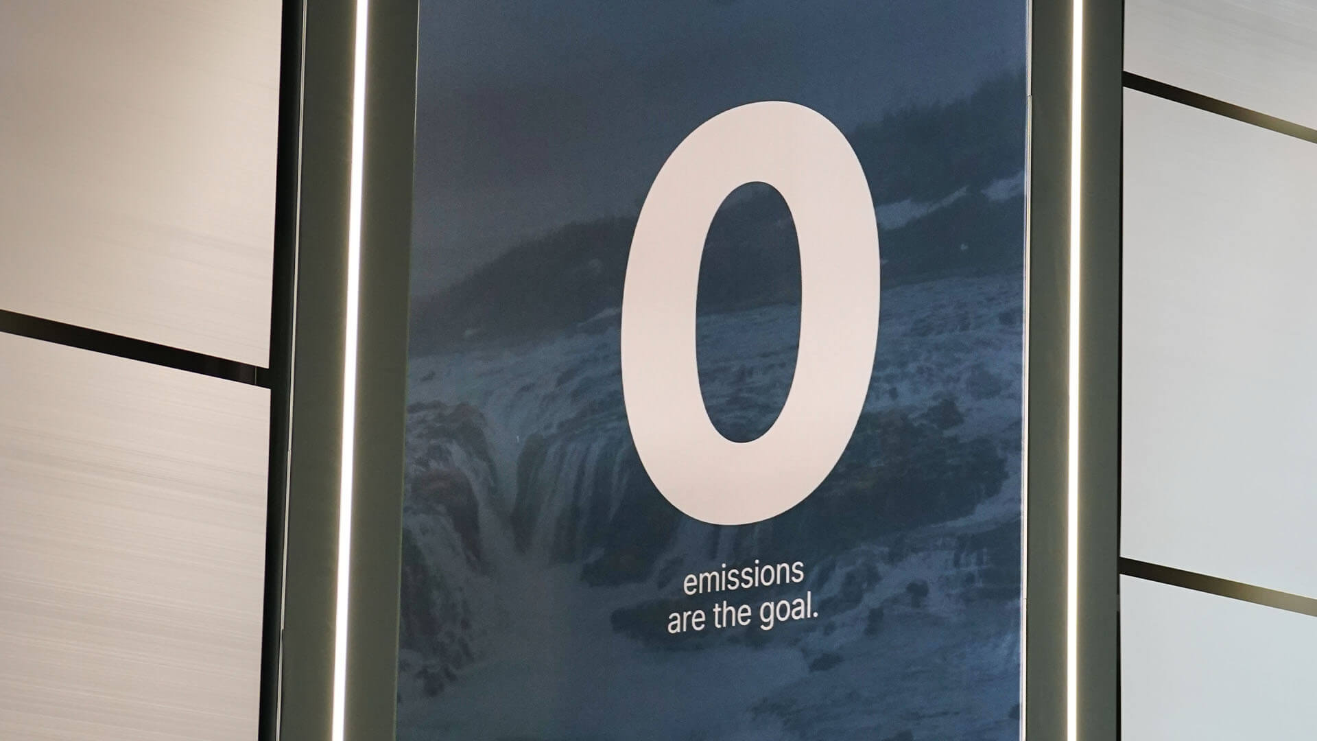
The trade fair stand shows what a consistently led brand can achieve in space. Image campaign, product communication and stand architecture interlock because they build on the same foundations. In close coordination, a presence emerged on which every surface has its task in the customer journey.